
 01Men
Zeta
Amber power, cut in gold.
- Amber
- Wood
- Intense
Amber WoodyView →
Find scroll effects, hero sections, galleries, and buttons for React and Tailwind CSS. Try them in the browser, adjust the settings, then copy the TypeScript into your project.
Live
Move over the tilt card, try a button, or switch to another demo. Open the component to see its props and source.
01MenAmber power, cut in gold.
Open any study to try the interaction and see the code behind it.
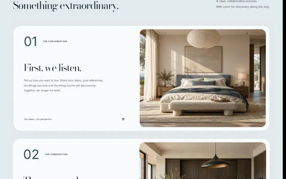
Keep each chapter in view long enough to read. As the next card slides over it, the previous one tilts back to show where you are in the sequence.
Try Stacking Cards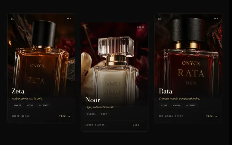
The product image, card, and highlight move at different depths. Try it with your pointer, then check the still version in reduced motion.
Try Tilt Card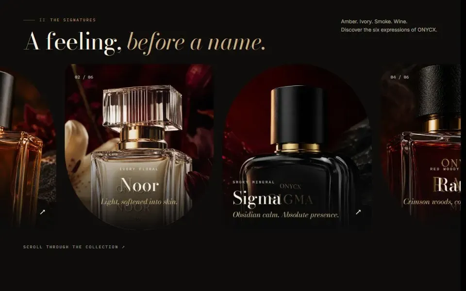
The gallery moves sideways with page scroll on larger screens. On smaller screens it becomes a native horizontal scroller.
Try Horizontal RailWorkflow
Try the same button in a wide or narrow frame.
Library

Reveal, highlight, and fit text in headings and statements.
8 components
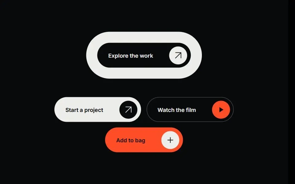
Add animated buttons and links with clear hover and focus states.
6 components
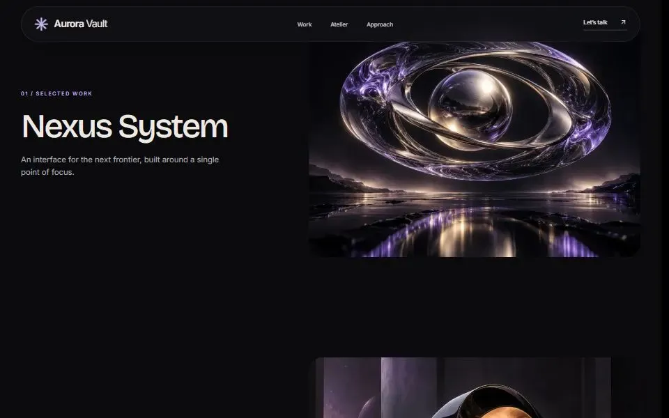
Build headers, side navigation, and scroll progress indicators.
3 components
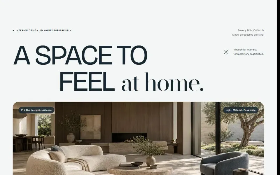
Start a page with a photo, video, or product-led hero.
5 components
Build pinned sections, horizontal galleries, and layered scroll effects.
12 components
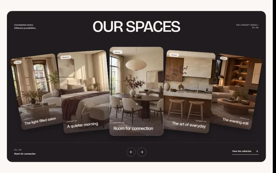
Show products, projects, and pricing in interactive layouts.
11 components
Principles
Check the reduced-motion version of any animation you add to your site.
If you use Lenis with GSAP, mount the scroll provider once in your layout.
Test the component at phone, tablet, and desktop widths with your own content.
Connect form submissions to your own service before publishing.