Library
Animated React components
Find a component by name or category. Open its page to try it, adjust its props, and copy the source.
- 62
- Components
- 12
- Families
- 28
- No extra packages
Foundations
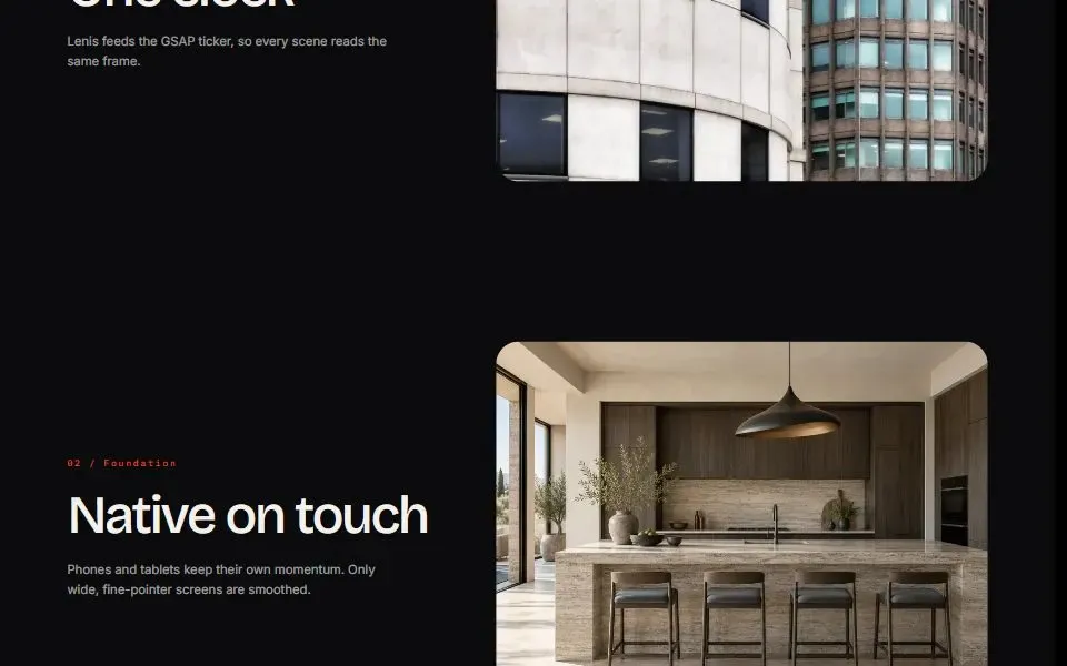
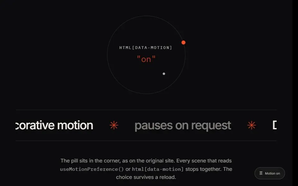
2Set up smooth scrolling and let visitors choose how much motion they see.
Text Animations
8Reveal, highlight, and fit text in headings and statements.
 gsap
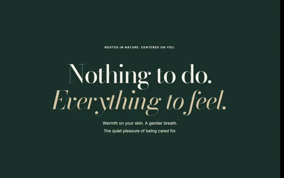
Scroll Word Highlight
Highlight a sentence word by word as the reader scrolls past it.
 no deps
Masked Line Reveal
Reveal a heading one line at a time, with a small tilt and blur as each line settles.
 motion
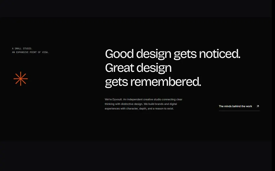
Split Text Reveal
Reveal a heading letter by letter with a flip, or word by word with a short rise.
 gsap
Highlight Wipe
Reveal a heading with a left-to-right highlight as the section scrolls into view.
 no deps
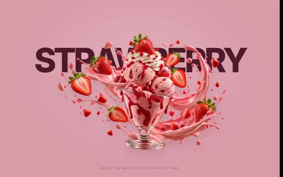
Fit Word
Fit a display word to a chosen share of its container using the width of the loaded font.
 no deps
Shimmer Text
Animate a gold-to-ivory highlight across a short line of display text.
 no deps
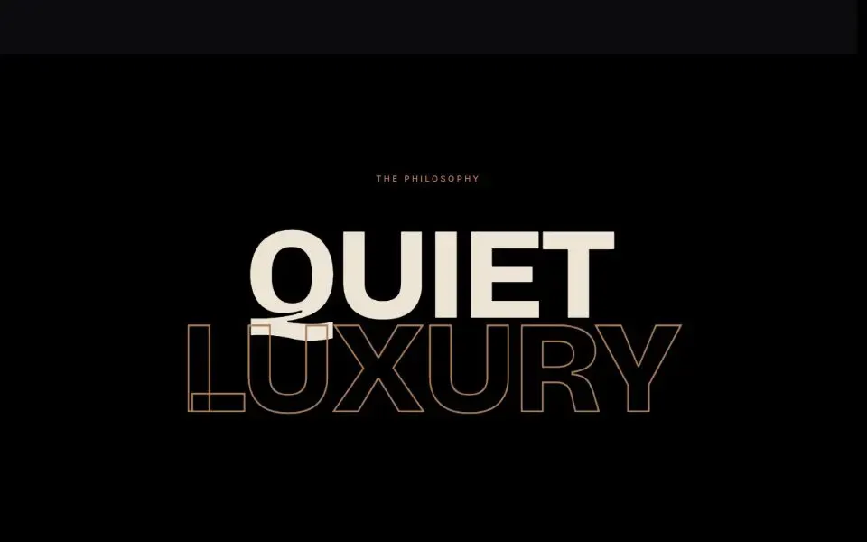
Outline Depth Statement
Layer solid and outlined words that move at different speeds as you scroll.
 gsap
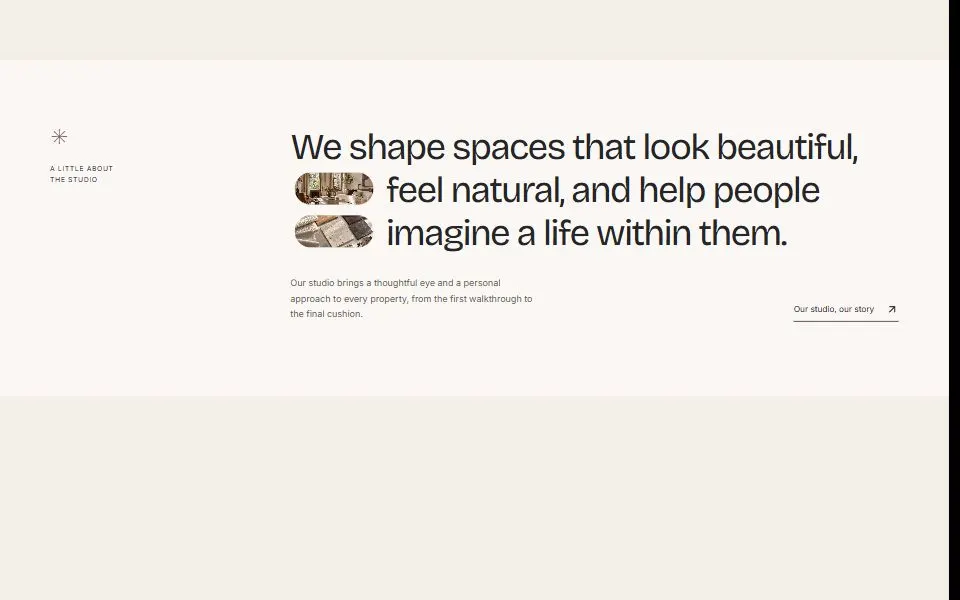
Inline Image Statement
Place rounded photos between phrases in a headline and bring the text into contrast as you scroll.
Buttons & Links
6Add animated buttons and links with clear hover and focus states.
 no deps
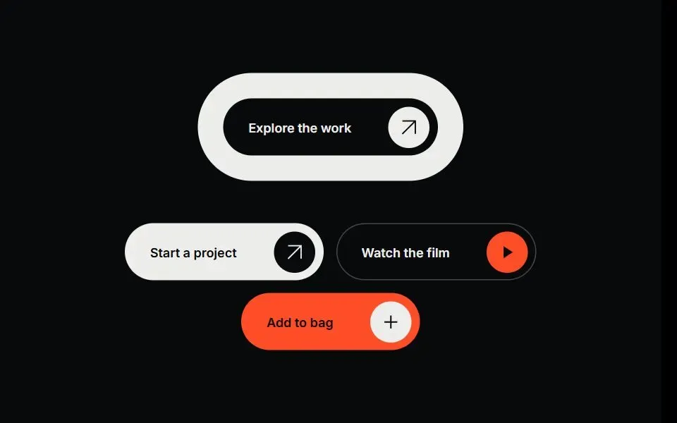
Pill Icon Button
A link or button with a round icon that rotates on hover. Choose from four styles and three sizes.
 no deps
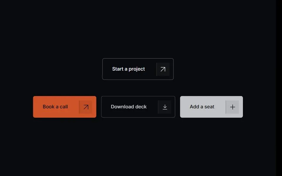
Split Icon Button
A button with a separate icon cell. On hover, the button lifts and the icon shifts toward the corner.
 no deps
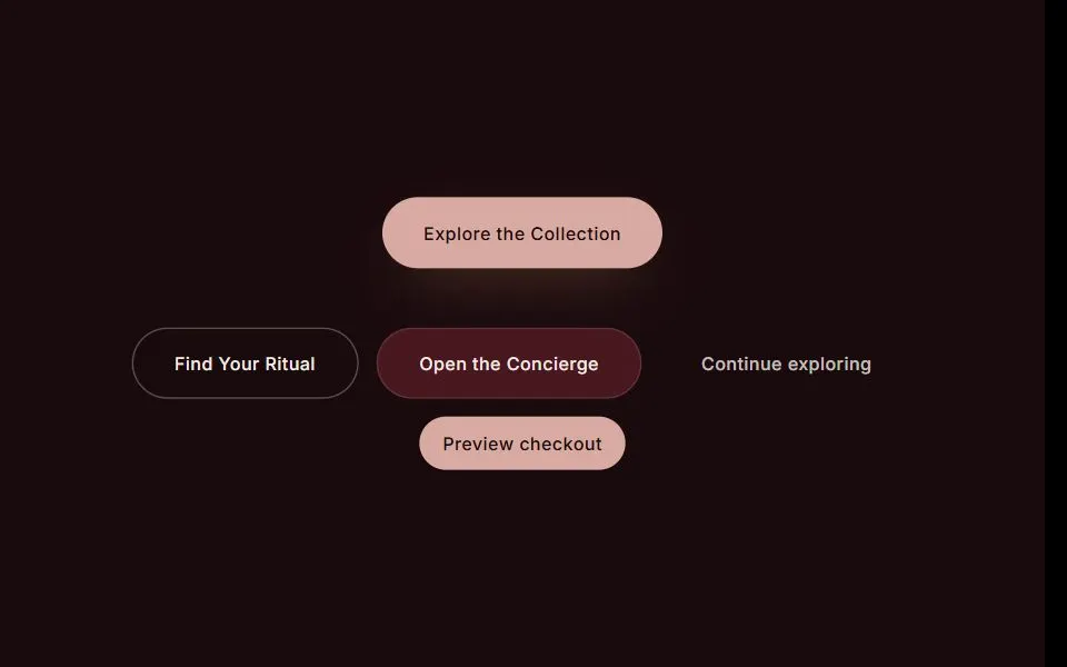
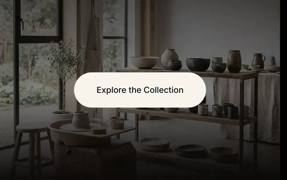
Sheen Button
Add a moving highlight to a rounded button on hover. Four styles and three sizes are available.
 no deps
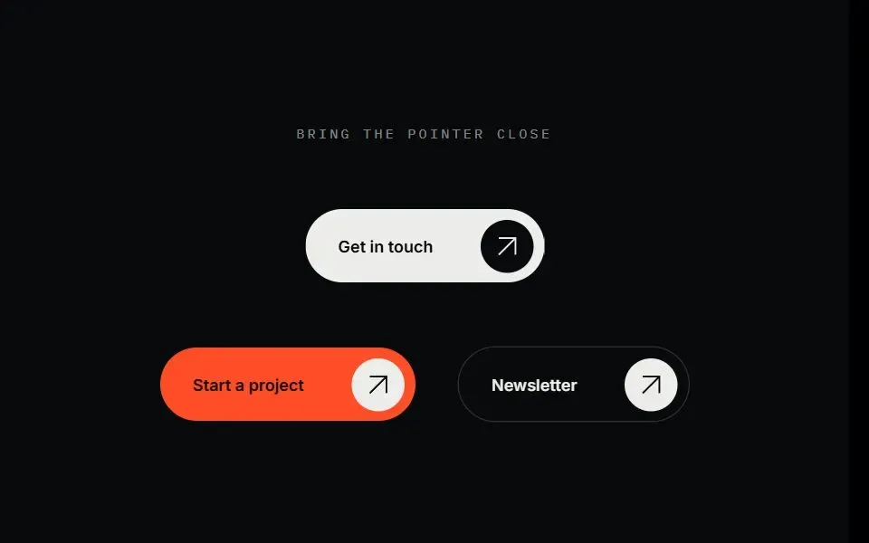
Expanding Arrow Button
A pill button that makes room for an arrow on hover or keyboard focus.
 gsap
Magnetic Button
A pill button that moves toward a nearby pointer and springs back when the pointer leaves.
 no deps
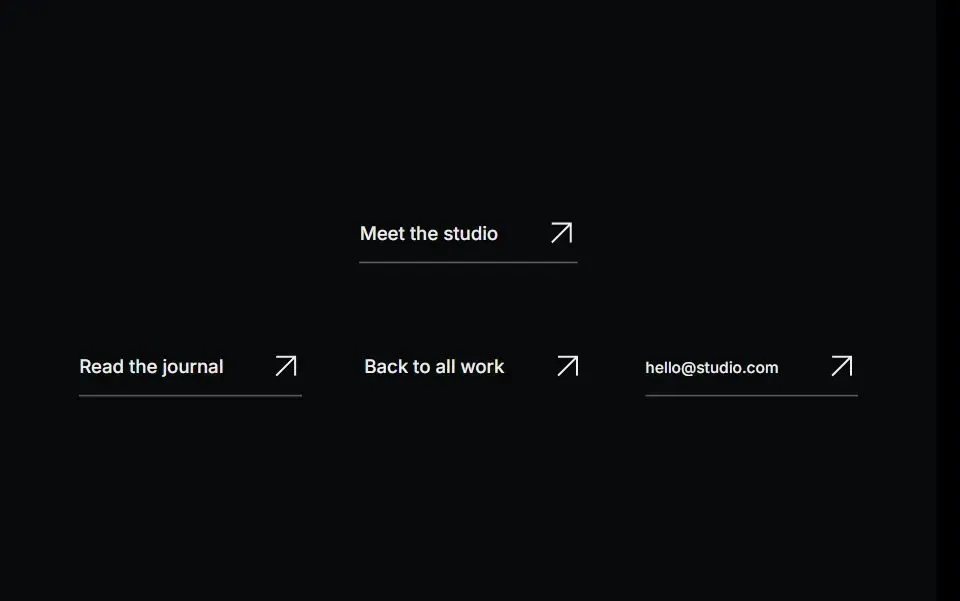
Arrow Link
A text link that gives its arrow more room and changes color on hover or keyboard focus.
Navigation
3Build headers, side navigation, and scroll progress indicators.
 no deps
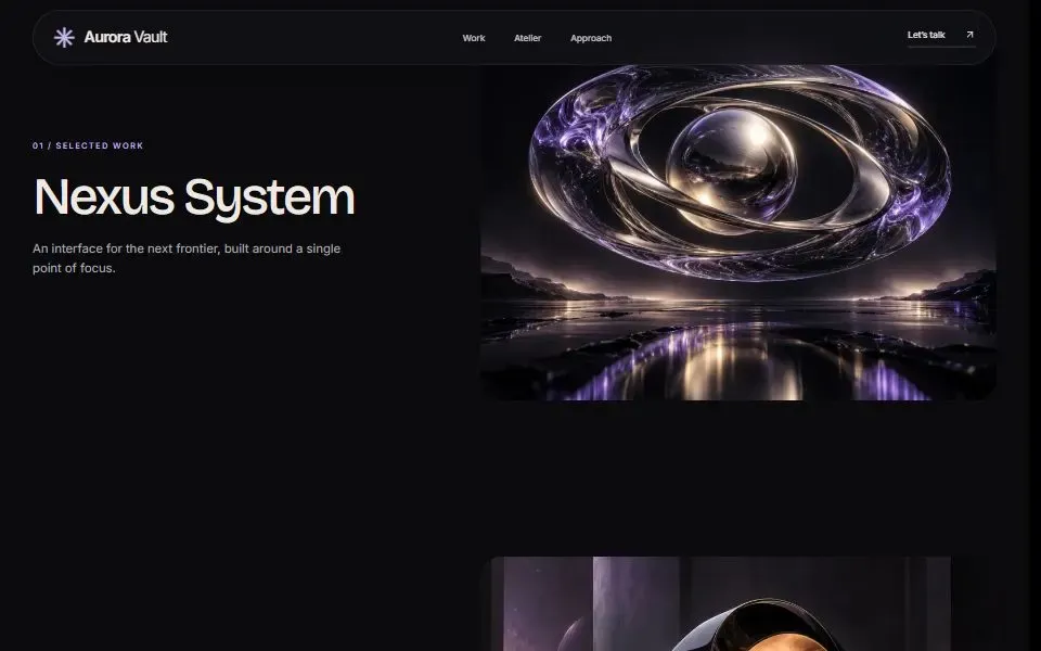
Floating Pill Navbar
A transparent header that gains a rounded background as you scroll. On phones, links open in a side menu.
 no deps
Expanding Side Rail
A compact sidebar that reveals its navigation labels when you hover over it or focus a link.
 motion
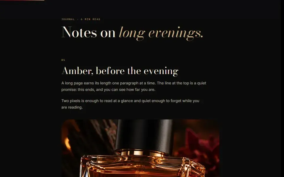
Scroll Progress
Show how far a reader has scrolled with a thin progress bar at the top of the page.
Heroes
5Start a page with a photo, video, or product-led hero.
 gsap
Editorial Hero
Pair a large headline with a framed photo, captions, and an inquiry link.
 gsap
Ghost Word Hero
Place a cutout image in front of an oversized word, with a separate headline and call to action.
 gsap
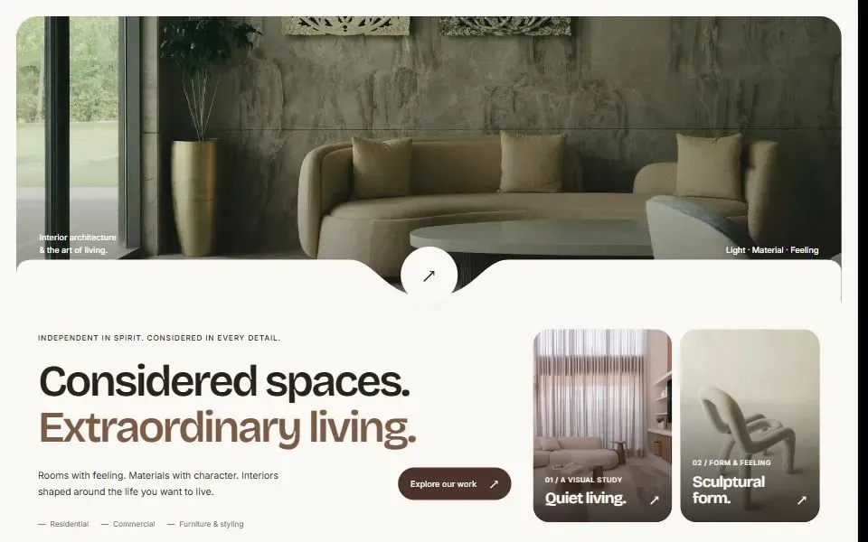
Seam Hero
Frame a hero photo with a curved edge around a round button, then introduce two featured projects below.
 gsap
Crossfade Hero
Cycle through full-width hero photos and headlines. Visitors can choose a slide or pause playback.
 gsap
Framed Video Hero
A framed hero with a poster, an ambient video, and a control to pause the motion.
Scroll & Parallax
12Build pinned sections, horizontal galleries, and layered scroll effects.
 gsap
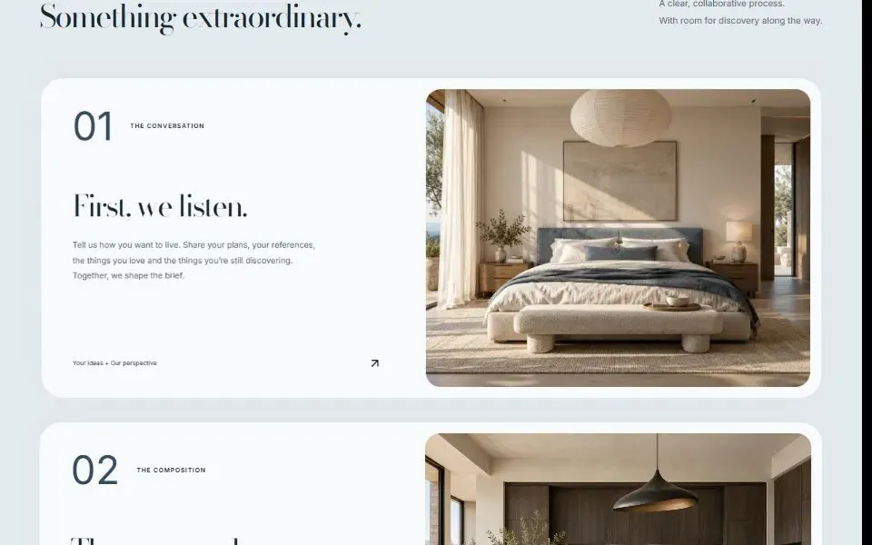
Stacking Cards
Show a process in sticky cards. As each card slides into place, the previous card tilts back.
 gsap
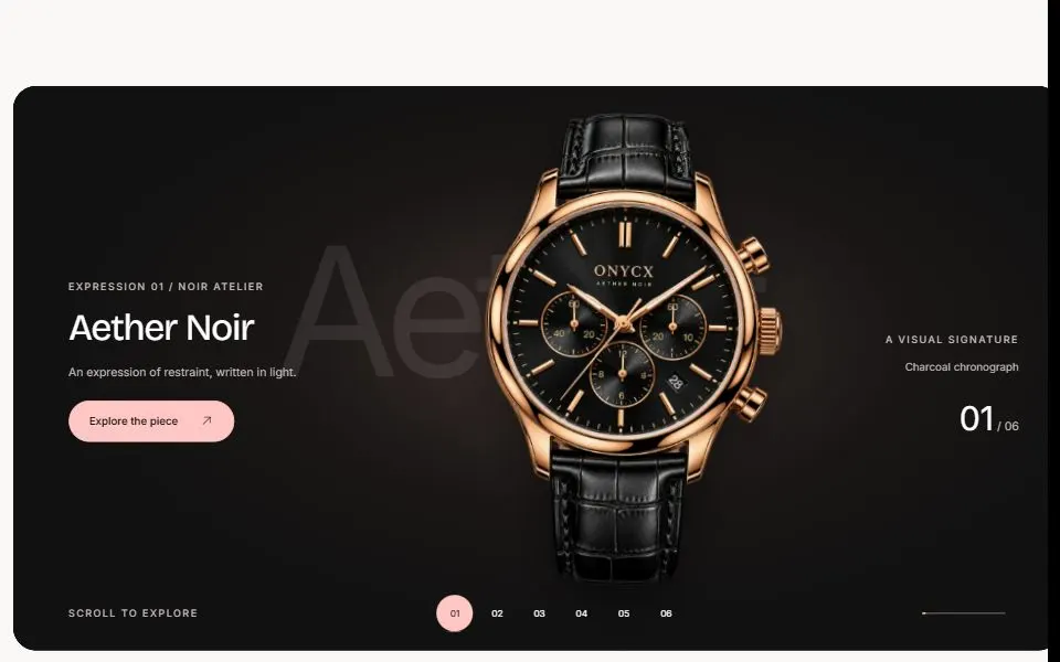
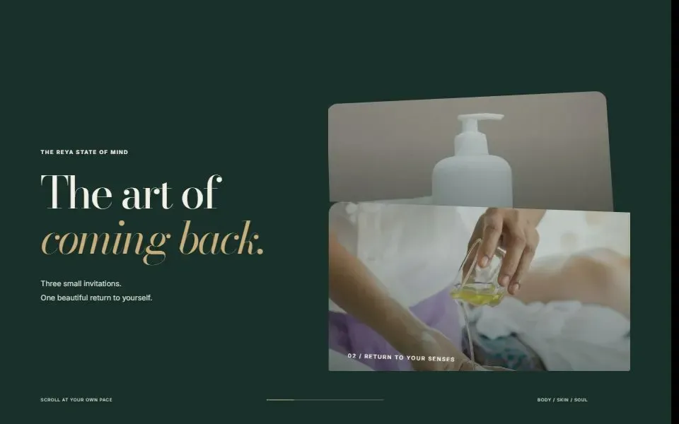
Exhibition Showcase
Give each product its own image, headline, and lighting in a pinned showcase. Visitors can jump straight to a product.
 gsap
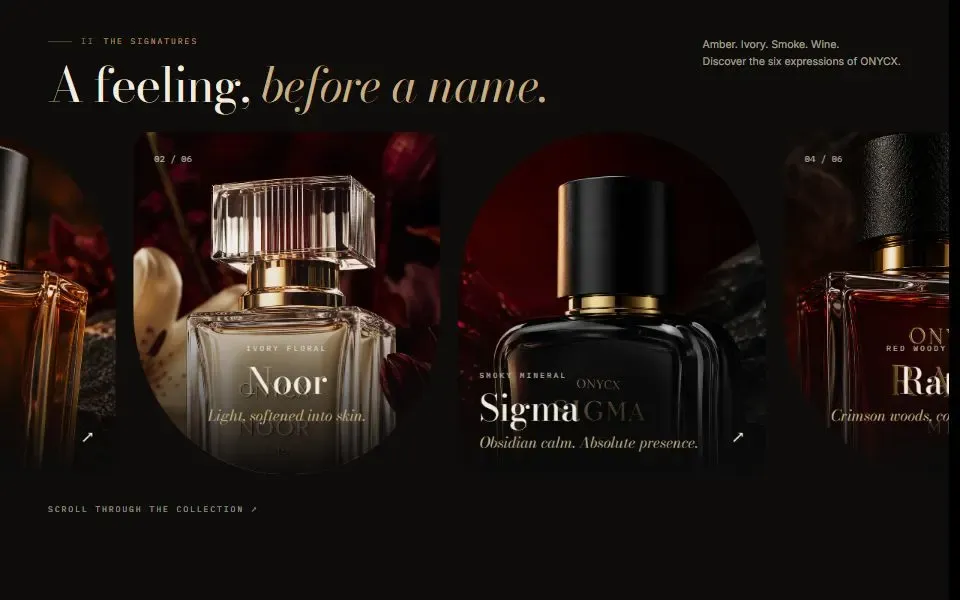
Pinned Card Deck
Keep a heading in view while photo cards rise into place beside it and the previous card tips back.
 gsap
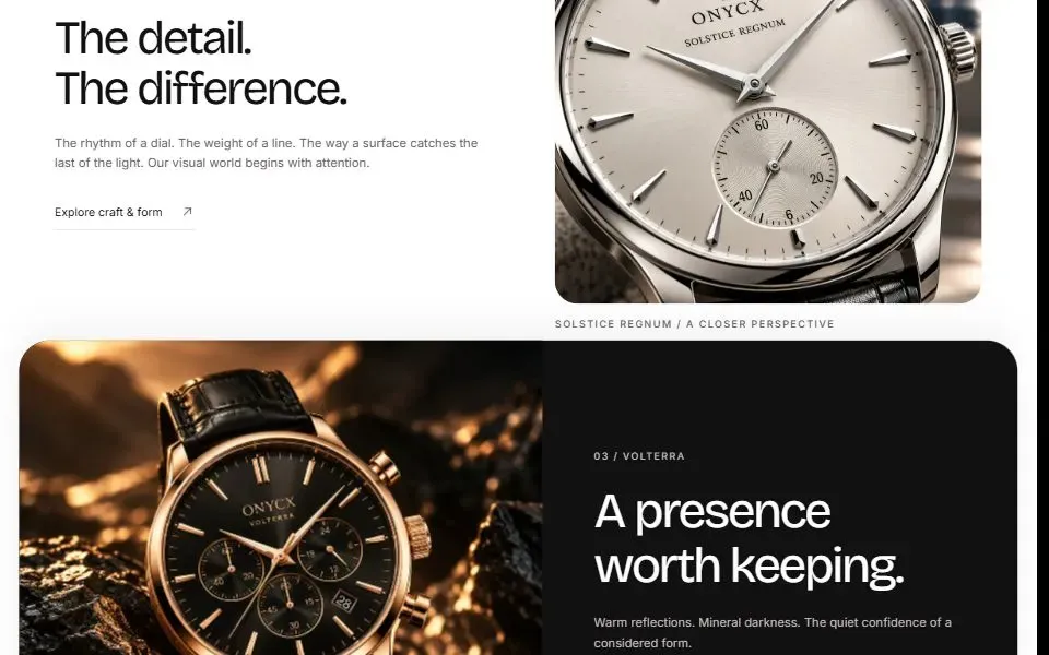
Horizontal Rail
Move a row of cards sideways as the page scrolls. A native horizontal scroller is available as a fallback.
 gsap
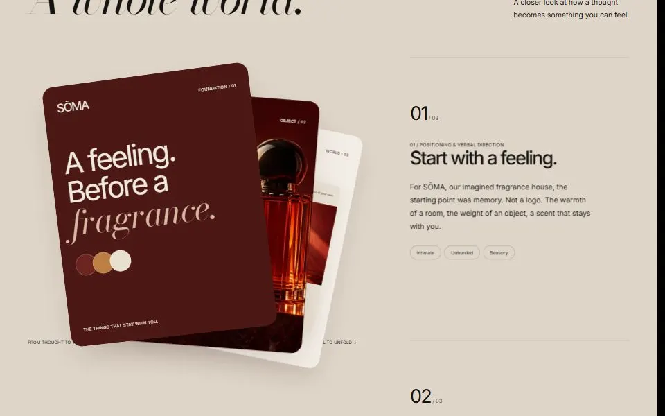
Overlap Sections
Stack page sections so the next rounded panel slides over the one you just read.
 gsap
Card Fan
Tell a story in chapters. Three cards fan out on a sticky stage and rearrange as you scroll.
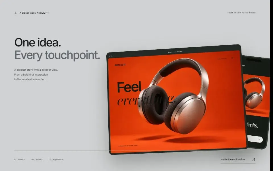 gsap
Device Spotlight
Present a project on desktop and phone mockups that straighten as you scroll past the description.
 gsap
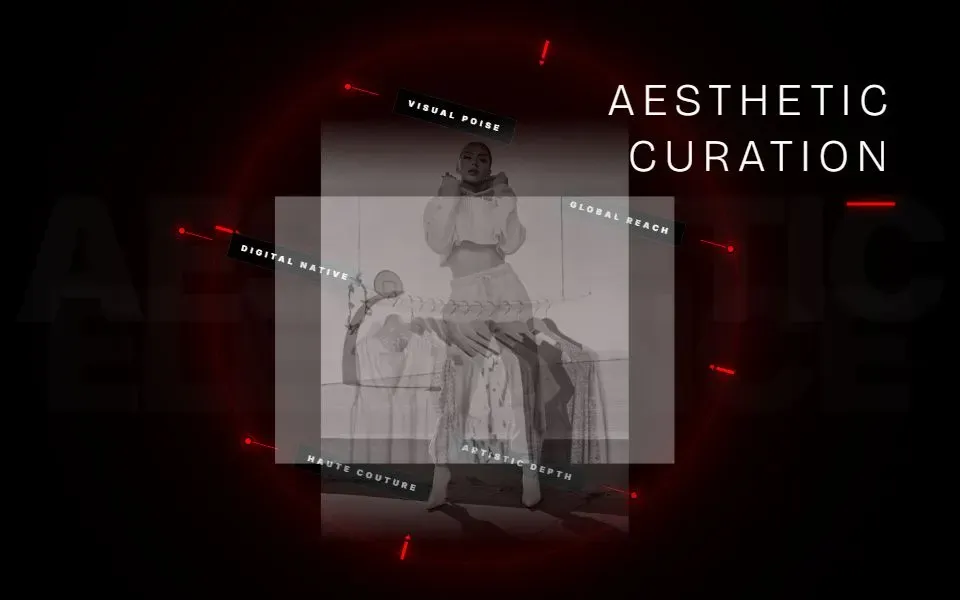
Ring Carousel
Browse portraits and headlines around a rotating dashed ring in a pinned scroll section.
 no deps
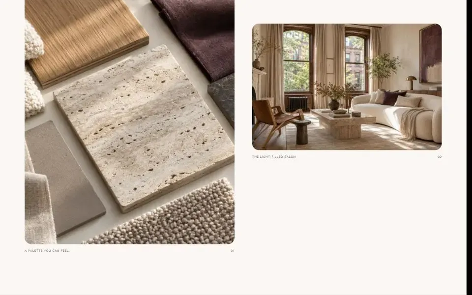
Sticky Scrollytelling
Keep a photo in view while alternating text cards tell the story alongside it.
 gsap
Parallax Image
Make a photo drift inside a fixed-ratio frame as the page scrolls, with an optional caption.
 motion
Scroll Marquee Word
Drift an oversized word behind a short statement as the page scrolls.
 Newno deps
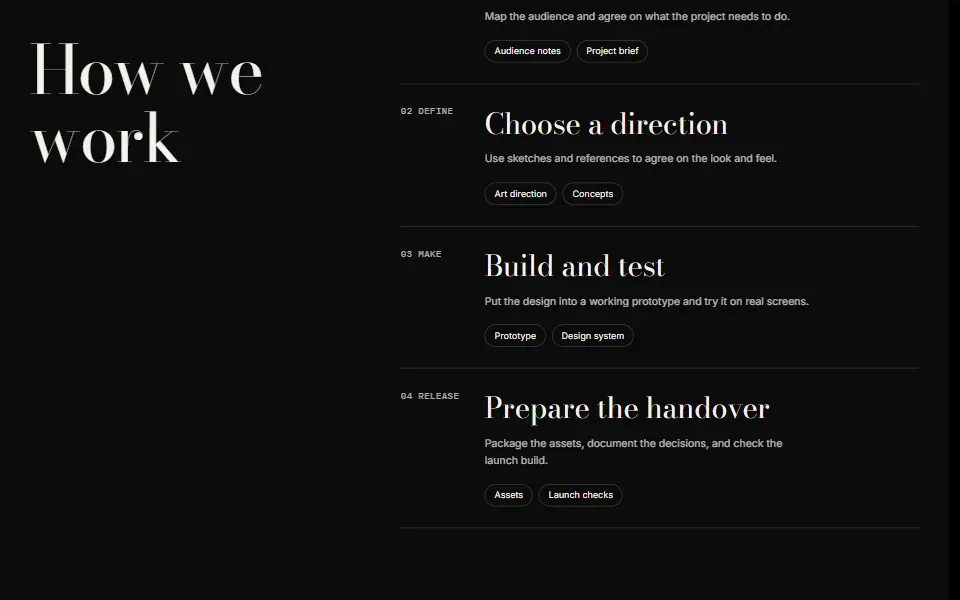
Process Ledger
Show project phases and deliverables beside a sticky introduction.
Cards & Galleries
11Show products, projects, and pricing in interactive layouts.
 no deps
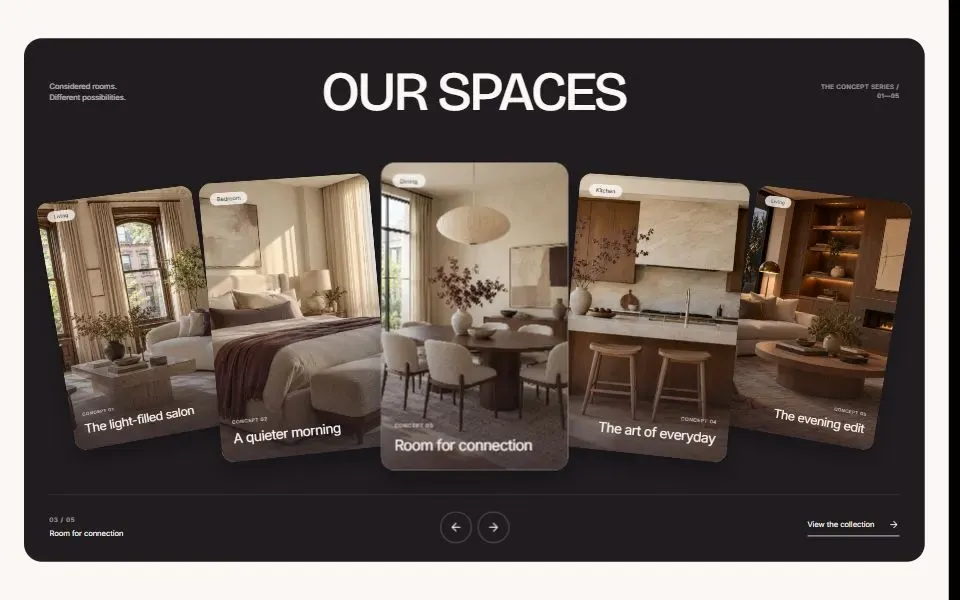
Coverflow Carousel
Browse a gallery in a five-card perspective carousel with arrow controls, a slide counter, and a link to the collection.
 motion
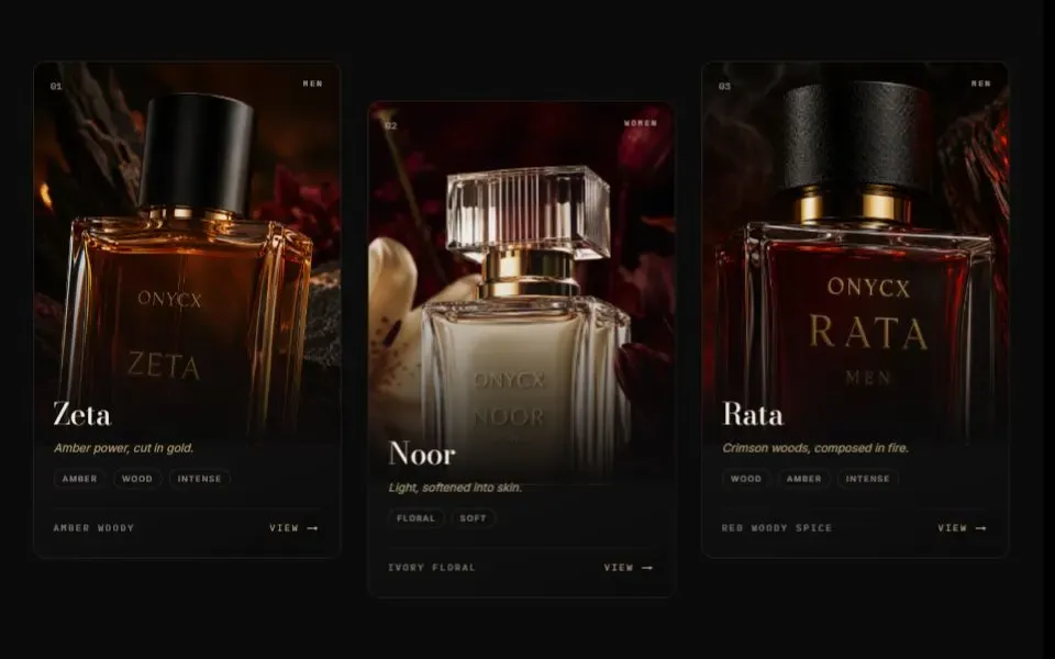
Tilt Card
A product card that tilts toward the pointer, with an image zoom and space for product notes.
 motion
Bento Grid
A grid of tiles that move into place as you scroll through the section.
 gsap
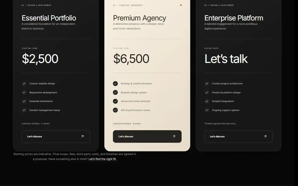
Pricing Plans
Compare three pricing plans with a market switch and a highlighted plan.
 gsap
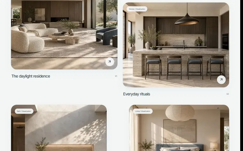
Project Gallery
Filter a two-column portfolio and open each project in a dialog with keyboard navigation.
 no deps
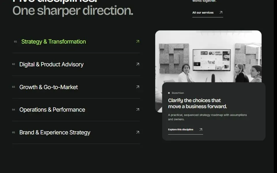
Hover Reveal List
Preview a service by hovering over its row or moving keyboard focus to it. The image and description change together.
 no deps
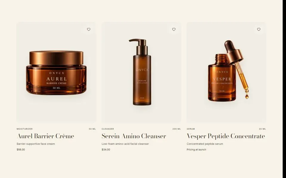
Product Card
Show a second product photo on hover, with favorite and quick-add controls.
 gsap
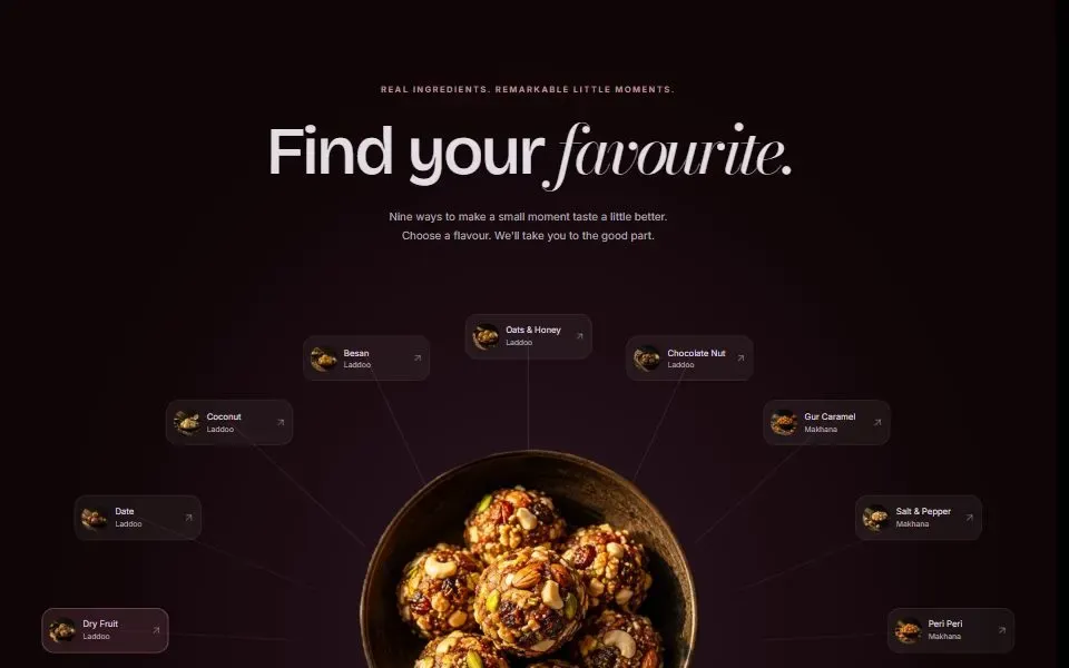
Arc Selector
Arrange products in a semicircle. Hover a thumbnail or select it with the keyboard to bring that product into the center.
 Newno deps
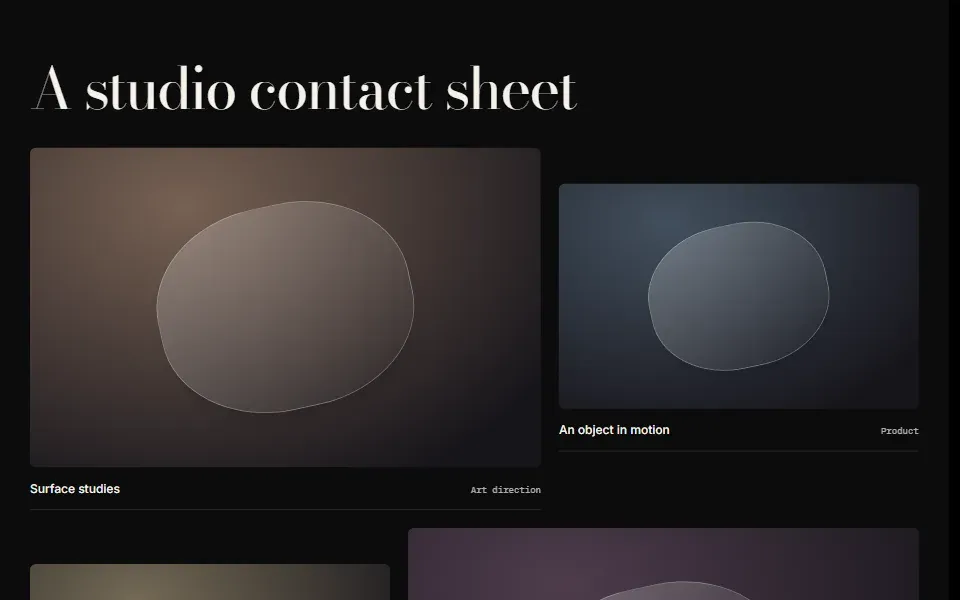
Contact Sheet
Arrange images and captions on a staggered editorial contact sheet.
 Newno deps
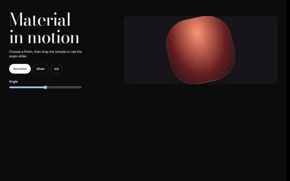
Material Finish Study
Compare three surface finishes and drag a sample to inspect its angle.
 Newno deps
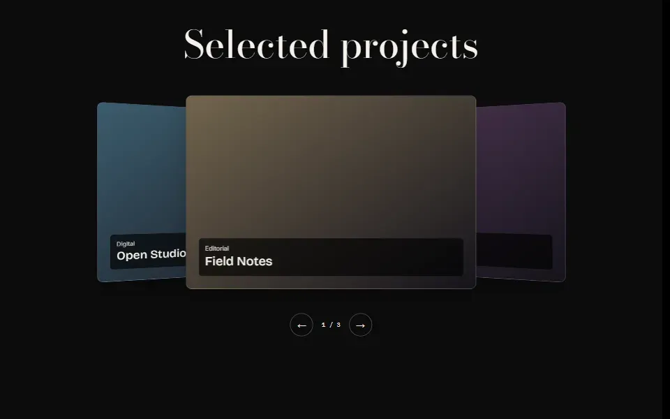
Project Orbit
Browse three project cards on a rotating perspective stage.
App & Dashboard
4Add dashboard previews, progress meters, timelines, and tab bars.
 motion
Command Center
Show how a dashboard might work inside a landing page, with five tabs for overview, quality, transforms, audit, and exports.
 no deps
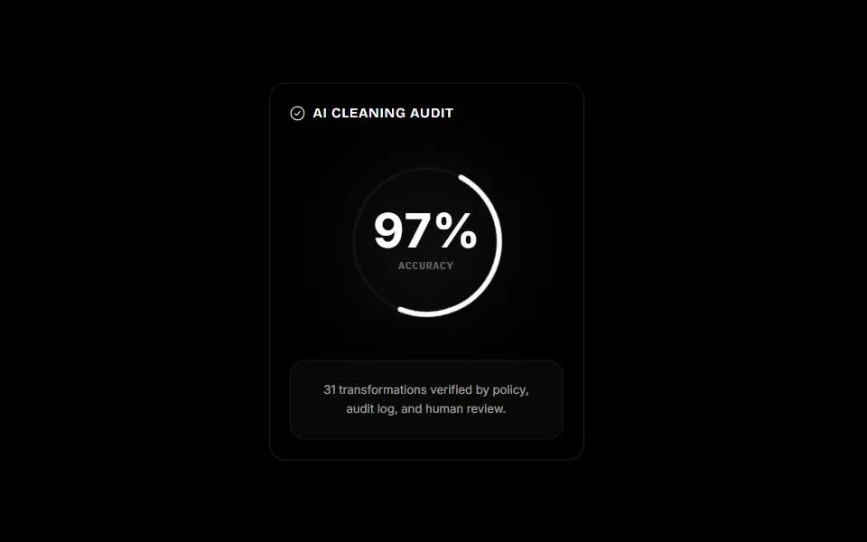
Progress Ring
Display a percentage in a circular meter that fills as it comes into view.
 no deps
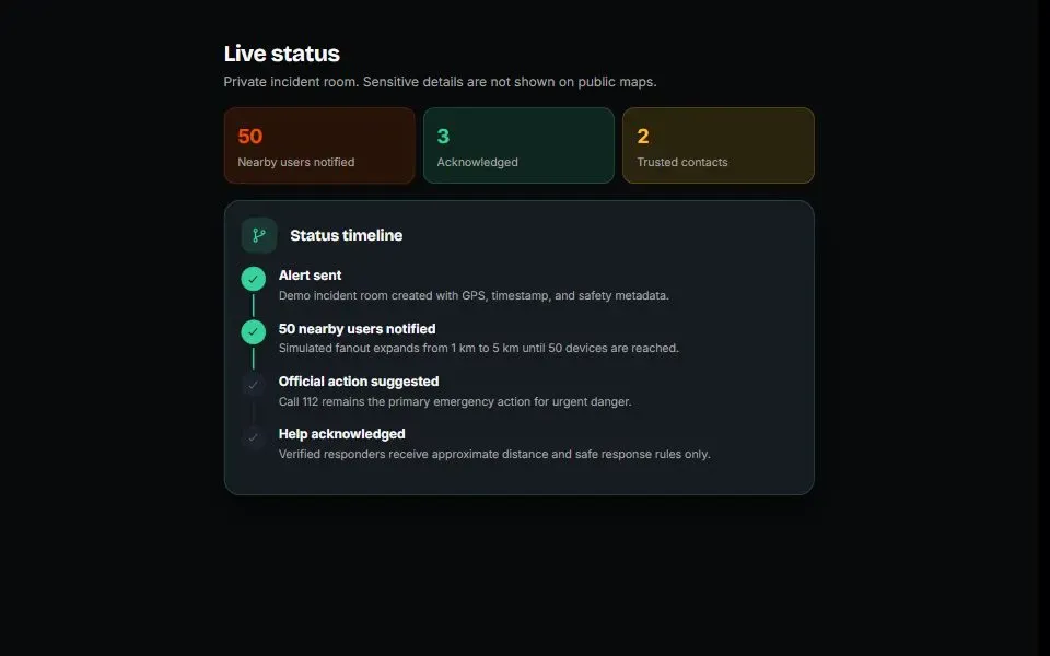
Status Timeline
Show the progress of an incident or task with completed and upcoming steps connected by a line.
 motion
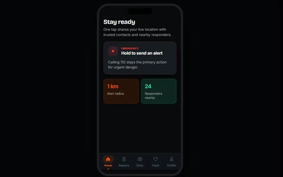
Bottom Tab Bar
A mobile navigation bar with icons and labels. The selected tab gets a colored icon, a pill background, and a dot.
Loaders
2Show loading progress with an optional opening animation.


Forms & Disclosure
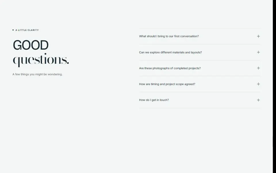
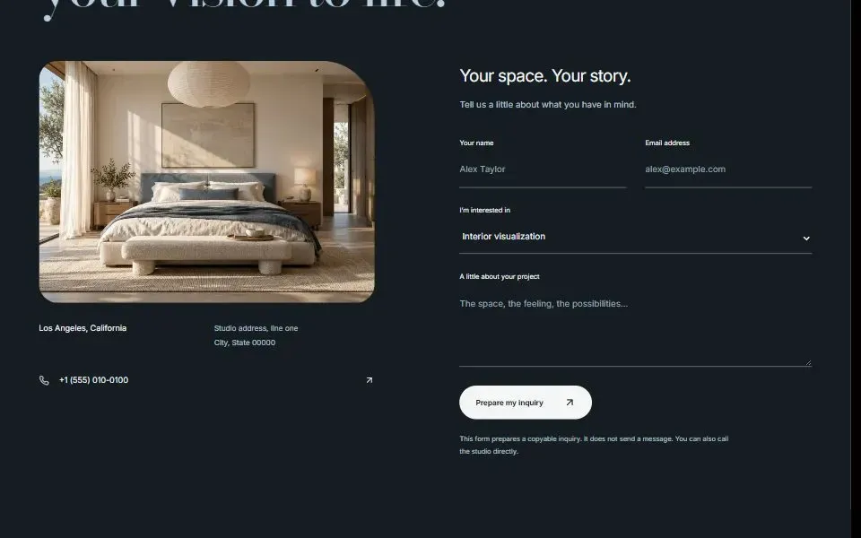
2Collect inquiries or organize answers in collapsible rows.
Backgrounds & Effects
5Add texture, lighting, and cursor effects to a page.
 no deps
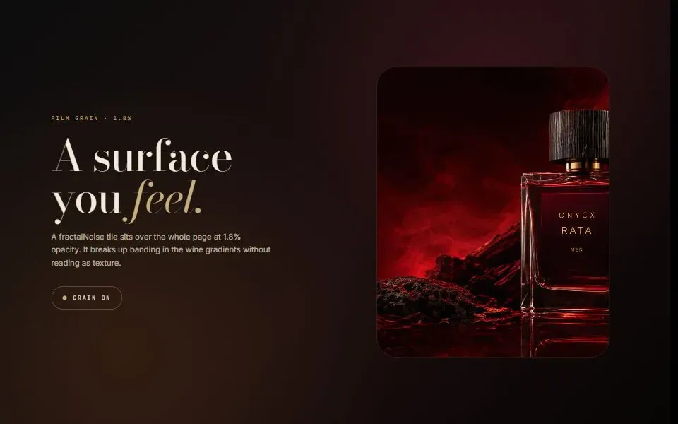
Noise Overlay
Add a subtle, static film-grain texture with an SVG overlay.
 motion
Cursor Glow
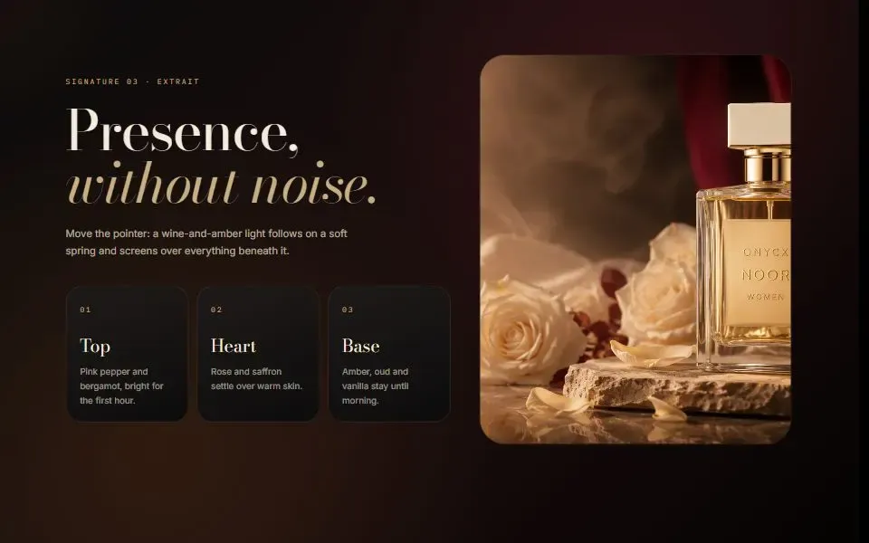
Add a soft amber and burgundy glow that follows the pointer with a spring.
 gsap
Pointer Cue
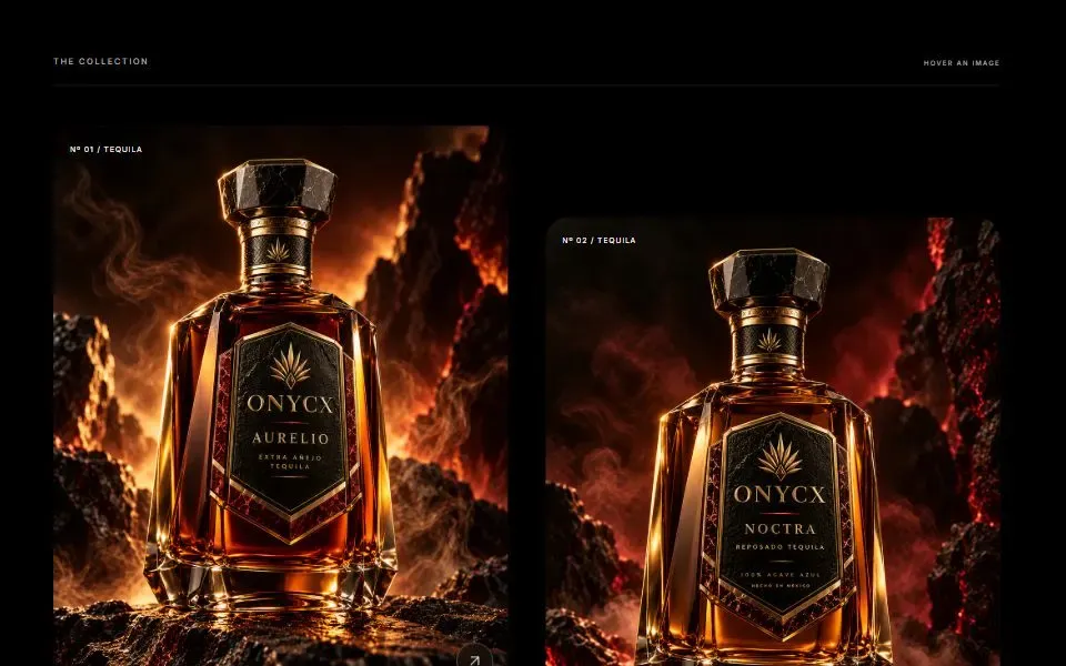
Show a small View label beside the pointer when it passes over a preview image.
 no deps
Grid Glow Background
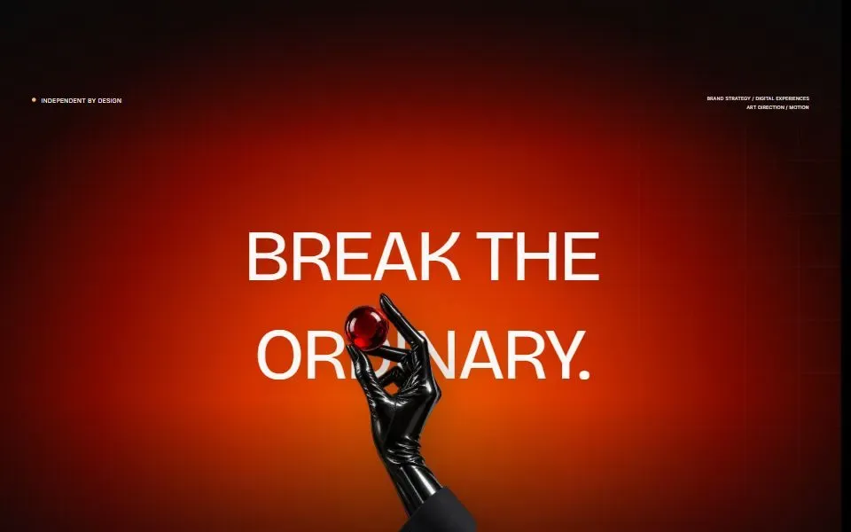
Add a faint grid, a warm glow, and shaded edges behind a hero section.
 no deps
Marquee Ribbon
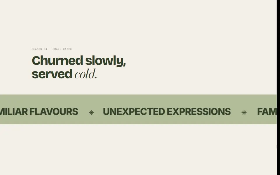
A full-width ribbon that loops short phrases with a symbol between each one.
Footers
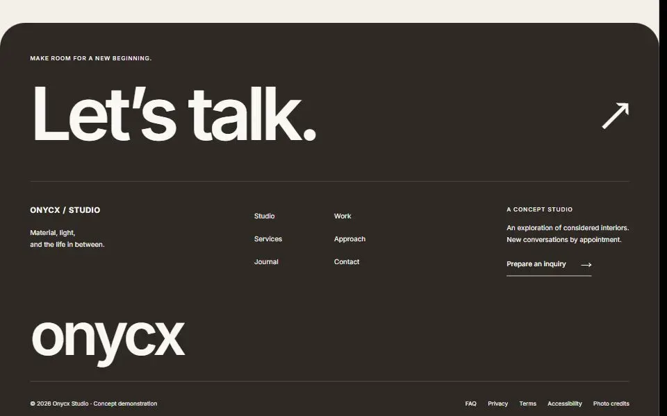
2Close a page with contact details, links, and a wordmark.